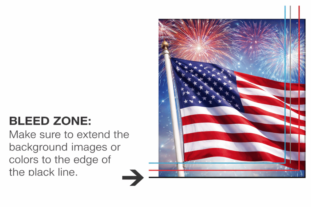
What does bleed mean?
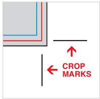
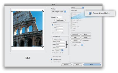
How to create crop marks? What are they?
What Are Guidelines and How Should I Set Them Up?
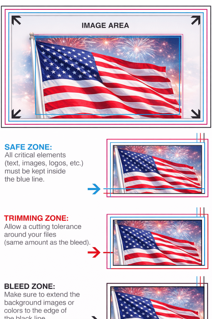
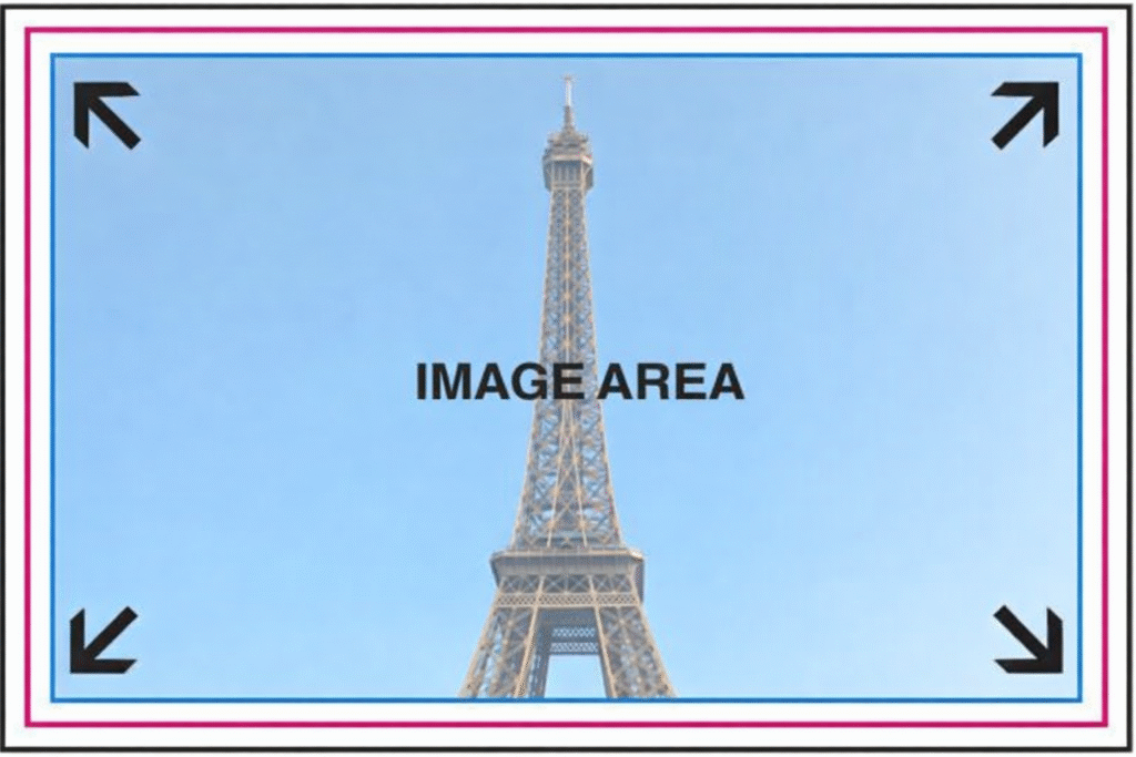
What Is the Image Area?
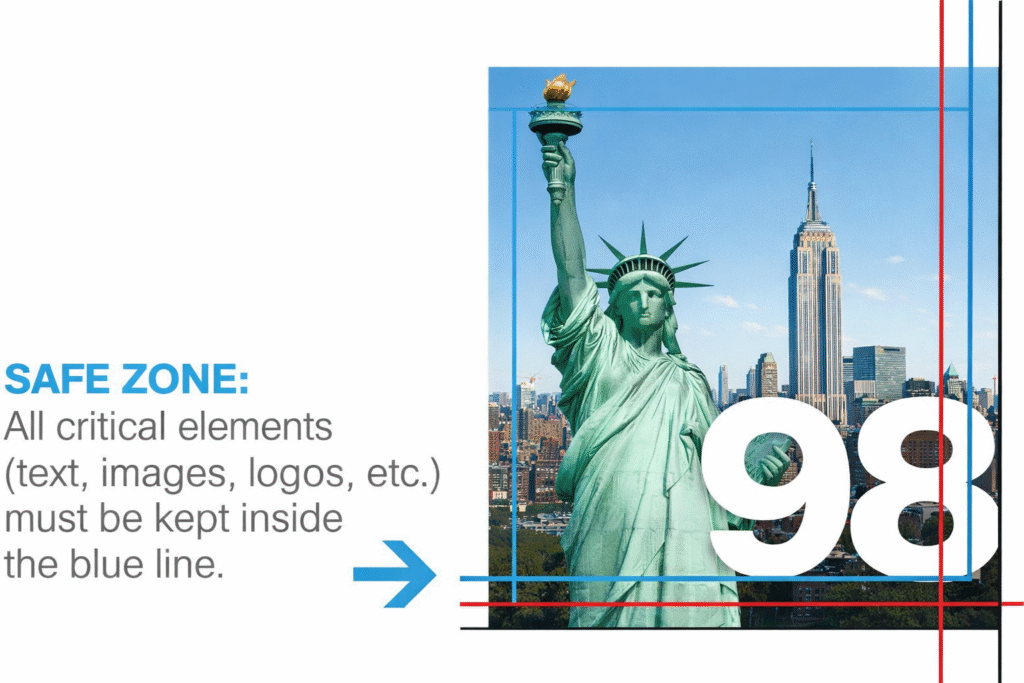
Can you explain what the safe zone is?
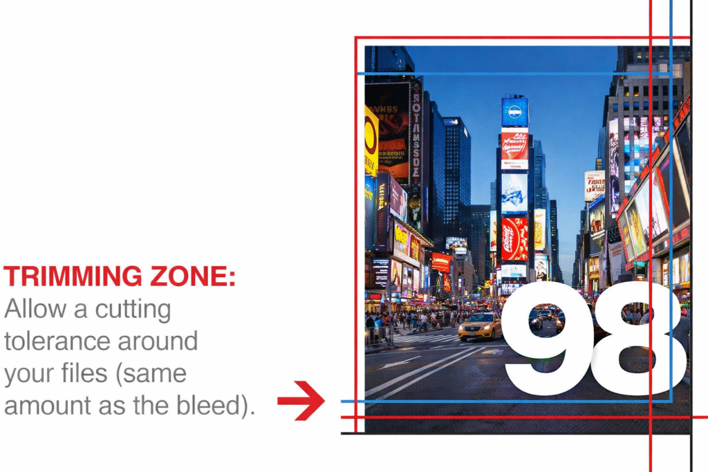
What is meant by the trimming zone?
Is it okay to use borders in my artwork?
How can I ensure the foreground and background colors match in my design?
What color choices are available?
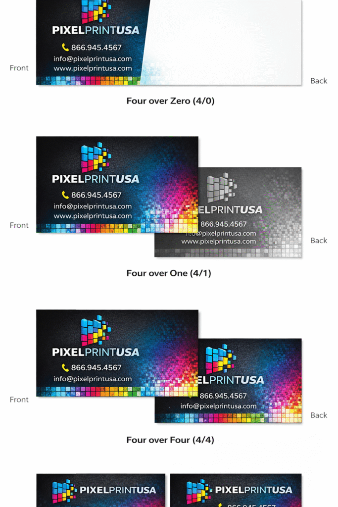
Which color mode is considered acceptable?
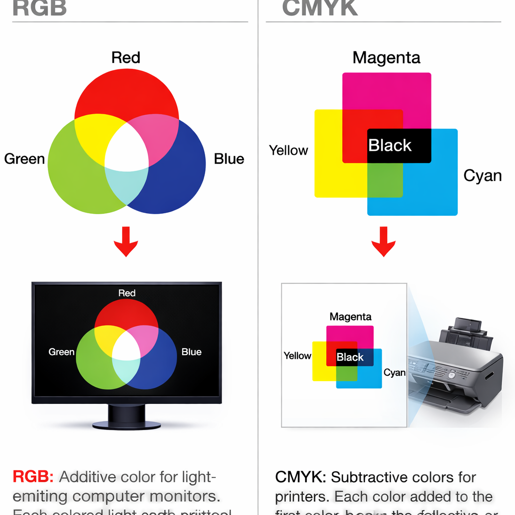
What does CMYK mean?
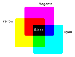
What is meant by four-color process printing?
What is RGB color mode, and how do I convert RGB to CMYK?
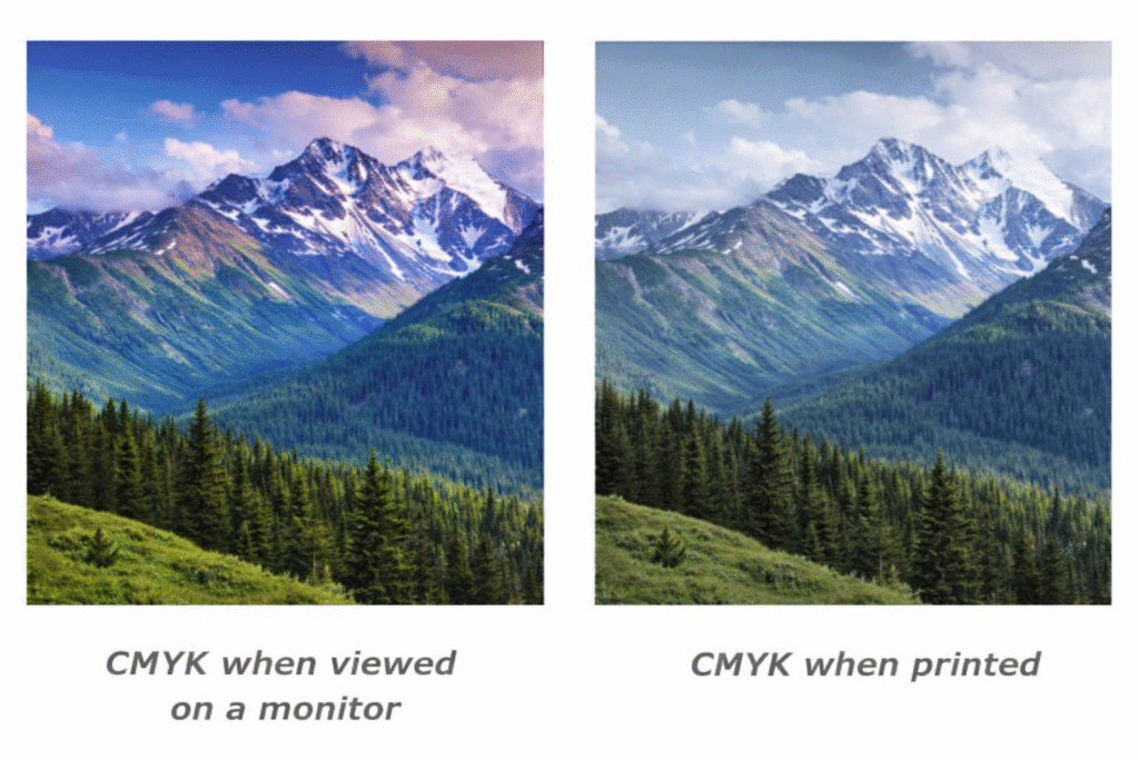
How important is it to convert my files into CMYK format?
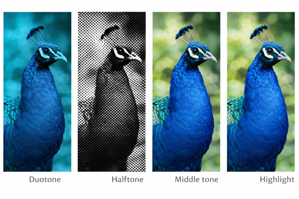
What are image tones and highlights?
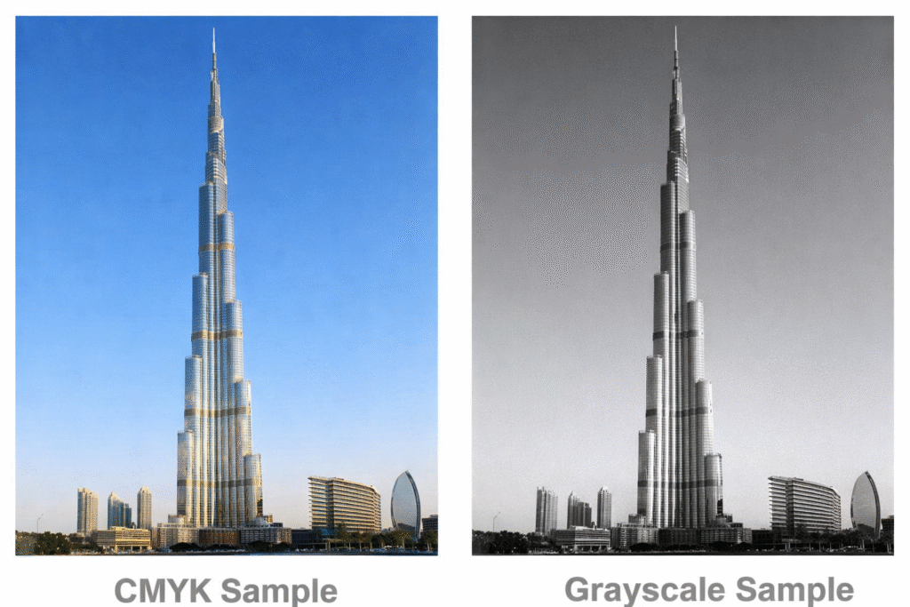
What is grayscale mode, and what is rich black?
Which color profile should I select when working with AI, PS, PDF, or JPG files?
What does RGB stand for?
In what ways do CMYK and RGB display colors differently?
What is meant by a bitmapped image?
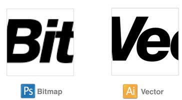
How is a vector image defined?
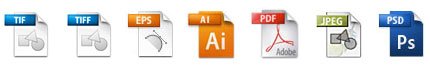
Which print-ready file formats are approved for upload?
What distinguishes a .TIF file from a .TIFF file, and a .JPG from a .JPEG?
What is the maximum allowed file size for uploads?
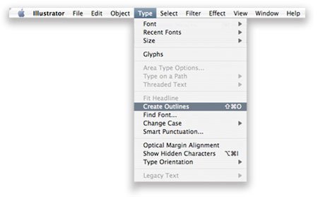
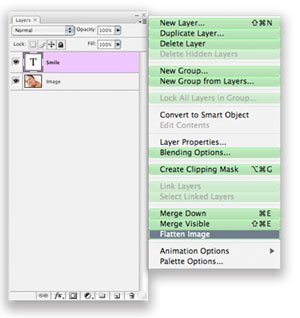
Why is it necessary to flatten files before printing?
What steps should I follow to flatten my files for print?
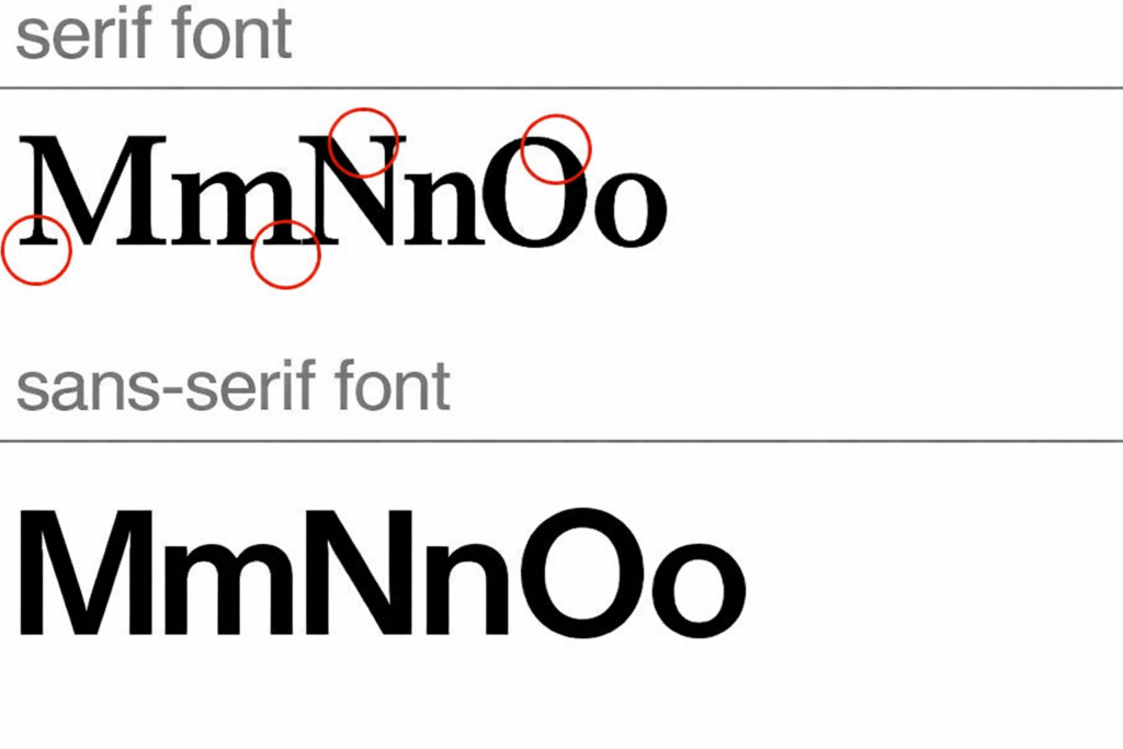
What is the difference between serif and sans-serif fonts?
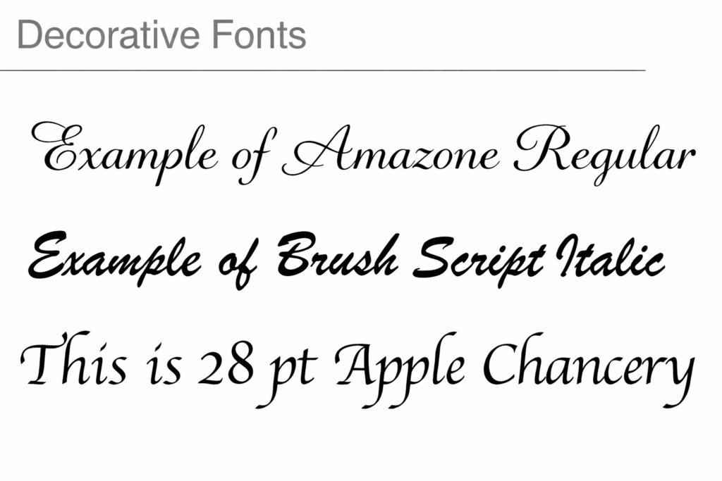
How are decorative fonts or decorative typefaces defined?
What does it mean for a font to be embedded?
How should I properly prepare my fonts and files for submission?
What is the distinction between a typeface and a font?
What is called resolution?
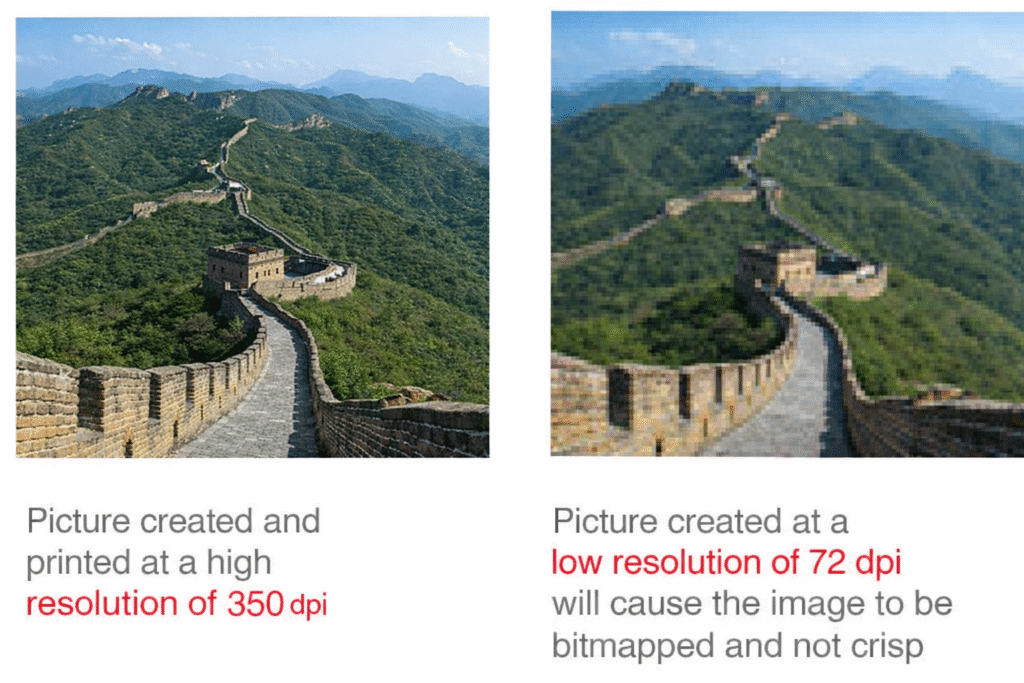
What resolution is considered acceptable?
Where can I find high-quality images?
What is the proper way to rotate my files so they print correctly?
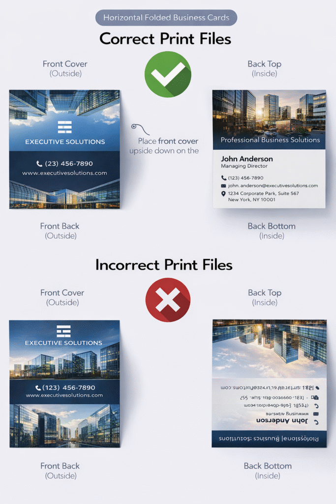
How should I orient my Folded Business Card or Greeting Card files to ensure accurate printing?